Four ways to turn your PowerPoints into SuperPowerPoints

Recommended articles
On related topics
One of the mainstays of our industry is the need present to other people. We have client presentations, internal reviews, and pitches to potential new investors. Not to mention lunch and learns, stakeholder reports, and an office favourite in Halifax—the six slide deck.
The common tool across our industry for these type of projects is PowerPoint. It’s easy to use and anyone can make edits—meaning you don’t always need to engage the creative team when you’d like to make changes.
But how often have you seen a presentation deck that leaves a little to be desired? Sure, not everyone is a designer, but not everyone has to be to make clean, polished, and professional looking PowerPoint presentations.
Here’s how:
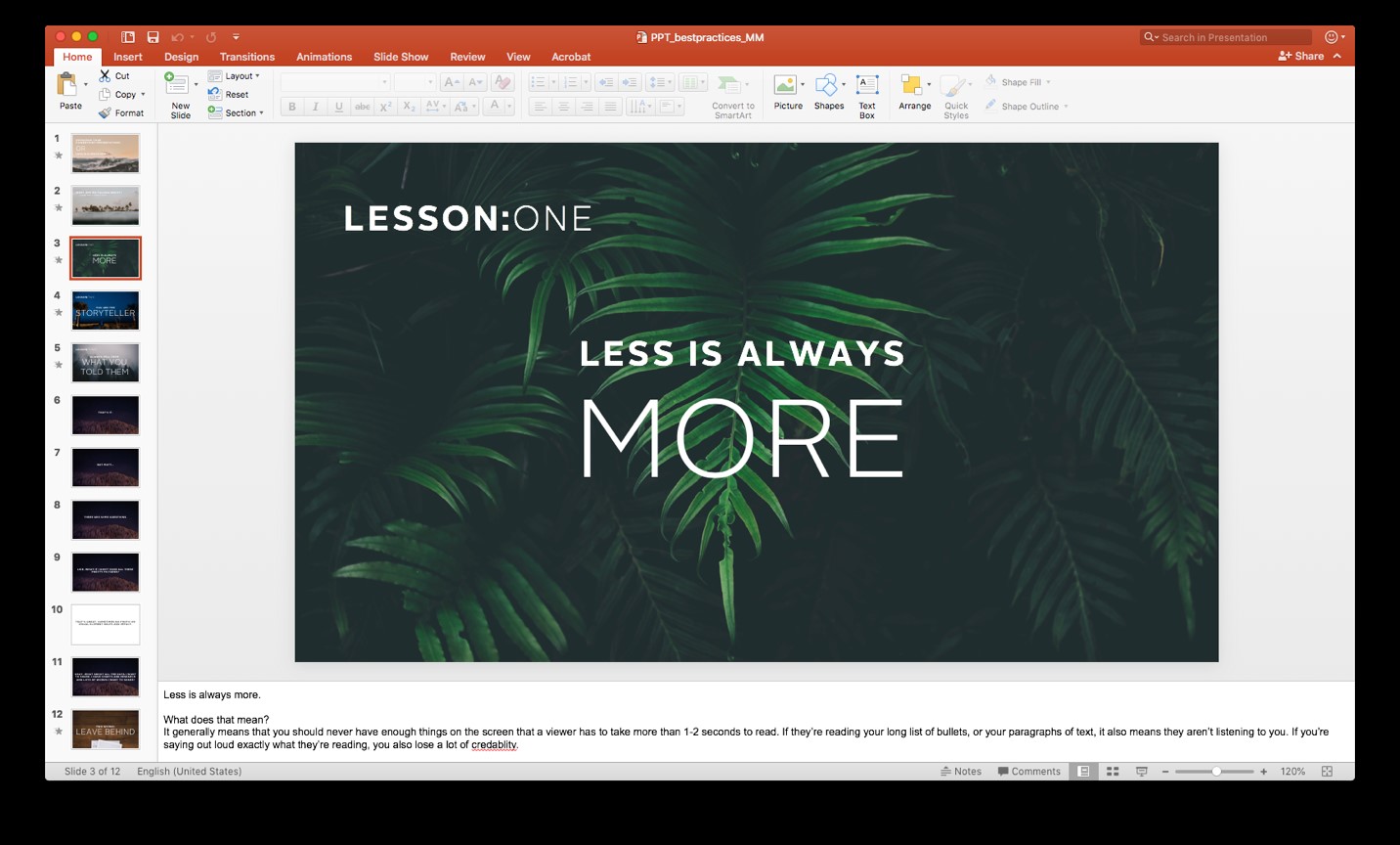
Less is always more
This is one of the most important things to think about when creating a presentation. Slides that have lots of information (basically anything that longer than a sentence or a few bullet points) are difficult to read. More importantly, they take focus away from the speaker.
If there’s too much information, viewers will be reading your slide while you’re talking, not paying attention to what you’re saying. The information on screen should support and summarize, not do all the heavy lifting.

You are the storyteller
You are in control of the information that’s being presented to your audience. For example, if you have a list of bullets, don’t show all of these bullets at once. Have each bullet appear as you’re talking about it. Then the audience is with your every word, and not looking ahead on your slide trying to figure out what you’re going to say next. You’re in control! Make sure you’re delivering the information in a way that compliments your presentation, not competes with it.

Consistency is key
One of the most useful parts of PowerPoint is that other people can write notes and edit the presentation from different locations and computers.
However, once many users have input on a presentation, slides can start to take on the appearance of having many different authors. Pay attention to things like fonts and font sizes, bullet styles, colours, capitalization, spacing, and all the other small details that can suggest sloppiness. Small details, but all small things that can add up in a positive, or negative way when it comes to your overall presentation.

Less is always more (still)
Is there an echo? There’s a reason why I’m bringing this up again. It’s important! Reducing information on the slide will help the people pay more attention to you and what you’re saying. Which means you’ll be a more effective communicator.
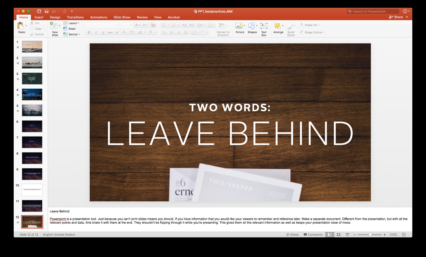
Have more information you need to share? Why not create a helpful leave-behind. This way, the audience knows that they will have a piece they can reference after the meeting and you can format it so it’s easier for them to read then just sending them your PowerPoint file after the fact.

If you want to learn more about building a SuperPowerPoint for your next presentation, contact our Presentation Training experts.
——— Matthew Morgan is a former Creative Consultant at NATIONAL Public Relations


